Tuesday, April 3, 2012

Isoline Map

http://mapmaker.rutgers.edu/355/links.html

An isoline map compares a variable across a geographic area and has lines on it that reference areas on that map with the exact same amount of that variable. In the map above, temperature in degrees Fahrenheit is what was being measured and everywhere a line goes has the temperature displayed somewhere on each line.

Propaganda Map

http://kuoest.wordpress.com/

A propaganda map is the use of a distorted or false map to get a political point across. Scale can be manipulated like it is in the propaganda map above to show a political view of what the world was like during the cold war according to Ronald Reagan.

Monday, April 2, 2012

PLSS map

http://forum.delorme.com/viewtopic.php?p=81273


Public Land Surveying Systems have been in use for a long time. It is used to show large land parcels until someone owns them. They are used primarily for rural, wild, and undeveloped land that is "public" until it is purchased from the government. This is a map of DeLorme and the large grids represent each parcel of land under the PLSS.

Hypsometric Map


 http://earthobservatory.nasa.gov/blogs/elegantfigures/category/cartography/

Hypsometric maps represent the changes in elevation of terrain by varying colors. Usually the lighter shades represent lower levels of elevation and as the elevation increases the colors get darker. This is a map of the world. The green areas represent places of low elevation and the tan areas start to get higher in elevation. The brown and darkest areas have the highest elevation.

Cadastral Map

https://www.e-education.psu.edu/natureofgeoinfo/c7_p19.html

A cadastral map is a map that gives information about property. It shows ownership of land in both a residential and commercial sense. In the cadastral map above, a neighborhood is shown with the names of the people who own the land.

Thematic Map

http://www.infousagov.com/thematicmap.asp

A thematic map shows a particular theme that is tied with some geographic area. It can be a social theme or a political theme. Many of the maps that we have looked at fits into the description of a thematic map because it is a very general type of map. It shows one particular set of data on a map. It can depict any type of value for any type of region. In this particular thematic map, the United States is separated by counties and shows the amount of new business.

Planimetric Map

http://www.esri.com/mapmuseum/mapbook_gallery/volume20/wastewater1.html

A planimetric map consists of all positions of horizontal features without taking into account elevation. It can show things such as buildings and structures, roads, rivers, and the distances between them. This map of Jefferson county, Kentucky is what was used by the Louisville water company because it was the easiest and fastest way to see all the essential information such as buildings, roads, sidewalks, parking lots and railroads.

Mental Map

http://mentalcharlois.wordpress.com/2010/02/15/the-mental-maps/

A mental map can be any one's recollection of a place or pretty much anything for that matter. Their personal point of view of the world can be a mental map. In the picture above, a young girl Cristina tried to accurately draw her neighborhood and immediate surroundings on a piece of paper. This would be an example of a mental map.

Flow Maps


http://www.mekongmigration.org/?page_id=25

Flow maps show the movement of a particular set of data from place to place. It could show the flow of money, communication, data, and in the case of the picture above, labor migration in the greater mekong sub-region. 

Cartograms

http://news.bbc.co.uk/2/hi/8280657.stm

A cartogram is a type of map that that shows certain attributes of geographic aspects as their area. The shape and size of the area is distorted to show the data that it is trying to convey. Any conventional map would would show the size shape and geometry according to its actual land mass. But as you see in the map above, the size and shape is greatly distorted because it is a cartogram according to population density in Great Britain. As you can see, the most populous area is London.

Cartographic Animations

http://www.blippitt.com/hurricane-irene-heads-toward-u-s-video-projected-path/


Cartographic animations are used to show how things happen over some span of time. They are often used on weather and news channels to show what to expect with the weather or projected pathways and movements of storms and hurricanes. The cartographic animation above shows the projected path of hurricane Irene as it makes its way to Cuba and the southeastern United States.

Infrared Aerial photo

http://www.stxmaps.com/go/brown-and-root-flats.html

Just like black and white aerial photographs, infrared photographs are taken either from airplanes or satellites above earth. Infrared photography is extremely sensitive to changes in temperature and can be used as thermal imaging. Specific vegetation, water usage, and different kinds of land can be identified using the special infrared lenses. The above picture was taken from a satellite of southern Texas.

Doppler Radar

http://www.noaanews.noaa.gov/stories/s1192.htm

Doppler Radar is a radar primarily used in weather forecasting which uses the doppler effect to display velocity data of wind speeds by taking both the linear and radial velocities of a weather system. It does this by sending pulses of radiation. This is what produces the circular image of the hurricane seen above in a doppler radar of hurricane Claudette on the coast of Texas in 2003. As you can see, the eye of the hurricane is just north of Corpus Christi up the coast.

LIDAR

http://www.extension.org/pages/9689/lidar-derived-products


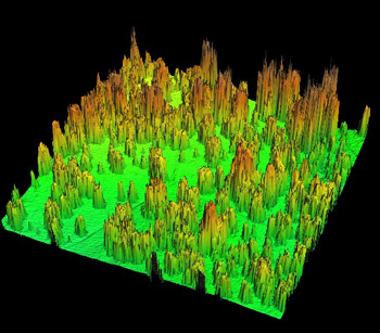
LIDAR, or Light Detection and Ranging, is an optical remote sensing technology that uses light to detect distances to an object and other properties of that target. This is done using pulses from a laser. LIDAR has applications in the fields of physics, geology, the military, geography and archeology among many other fields. Flood risk assessments have been increasingly using LIDAR as well because of the highly accurate landscape and elevation characteristics LIDAR provides as such in the picture above.

Continuously Variable Proportional Circle Map


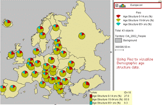
A continuously variable proportional circle map is like the range graded one in that it uses circles to portray a set of data, however there are more things going on in a continuous variable proportional circle map. There are more variables in this instead of just one. The larger the circle means there are more people within the population. Inside the circle, more variables of data are represented. In the above map of France, the inside of the circles compare the different types of meat distributed to Paris from different regions of France.

range graded proportional circle map

http://www.creativeclass.com/_v3/creative_class/2009/08/


Range Graded proportional circle maps are maps that utilize circles of different sizes proportional to the given value of data. The larger the circle, the more amount of government money allotted to each state via the bailout according to the map above. each state gets a circle which represents an amount of money proportional to its size.

Unclassed Choropleth Map

http://geoanalytics.net/and/papers/ica01.pdf


An unclassed choropleth map uses shading rather than numerical data on the map in its various areas of the map. Each area is given a color or shade proportionate to its data. The darker the region, the more intense on the scale of data than the lighter regions. This unclassed choropleth map shows the birthrates in Europe through a varying and proportional degree of darkness.

Univariate choropleth map


www.geog.le.ac.uk/russianheartland/DemographicMaps/Raions.html

A univariate choropleth map is the simplest form of a choropleth map and only has one set of data it shows. Different areas are broken down into differently shaded regions depending on their representation of the data being shown. In the map above, it shows the population density of Russia's raions in 1985.

Standardized Choropleth Map


 http://www.missourieconomy.org/newsletter/hispanic_pop2008.html

A standardized choropleth map, unlike its standardized counterpart areally averages its data and can therefore compare areas of different sizes. The standardized choropleth map above compares the hispanic population of each county in the state of Missouri. As you can see each county has its average population in addition to its shade of color.

Unstandardized Choropleth map

http://bigthink.com/strange-maps/308-the-pop-vs-soda-map

An standardized choropleth map is a type of choropleth map that compares raw percentage data with nothing associating the different sections. Nothing is averaged out nor does there need to be an even amount of intervals. The above map shows the counties of the United States and their percentage use of each generic name for soft drinks. "Pop" is predominantly used in the midwest states, while "Coke" is used mostly in the south.